Advanced Architectural Design, well it's been a good semester. I've explored programs, ideas, and techniques I had previously never considered.
Sketch up allowed me to catch up on a program I hadn't used in years, but really needed to become familiar with yet again. My guess is I'll end up using this at some point again in college. I was also introduced to revit, a program that will likely encompass plenty of my time in the next couple years. As far as programs, these are the most important to me currently, and I want to be able to dive into them more in depth, but as far as this class provided, it was a good introduction. Mr. Carson allowed us to explore these programs on our own, and it made us understand that a lot of the time in the future we will be alone to figure stuff out, and we need to start doing this now. But it was always nice if we had a question, he was there to answer it.
The class was useful in the sense that we didn't just work on a typical architectural project. We mixed up the project between a house design, and a garden design. This allowed us to explore architectural principals related to vegetation and shade. The garden allowed us to think about being landscape architects. The class allowed us to think outside of the box to attempt to solve architectural problems.
Architectural Design
Tuesday, May 31, 2016
Tuesday, May 10, 2016
I feel
I feel like we should feel like we're doing something important. Well what the heck does that even mean? When considering the English shift to using the phrase "I feel like," we slightly change what we are attempting to say than if we were using other phrases. A feeling is nice but we need to change our feelings to what we know if we truly want to succeed in life, but maybe no architecture.
For architecture a feeling is kind of a good and a bad thing though. It take some type of intuition and creativity to come up with a problem solving design. I feel like this might work is a solid answer to an issue. You need to develop and initial feeling, an initial spark, to come up with something new. But at the point a "feeling" needs to become something greater, we must use ideas and words that are more concrete. Architects can't have a feeling about a design forever, at some point the design must come to exist.
For architecture a feeling is kind of a good and a bad thing though. It take some type of intuition and creativity to come up with a problem solving design. I feel like this might work is a solid answer to an issue. You need to develop and initial feeling, an initial spark, to come up with something new. But at the point a "feeling" needs to become something greater, we must use ideas and words that are more concrete. Architects can't have a feeling about a design forever, at some point the design must come to exist.
Monday, May 2, 2016
The "next" Age
The shift age is a combination of the ages that have come before it, but is completely different at the same time. The information age brings us the idea that everything/everyone is a part of one world, this is instilled in the shift age to make it basic thought. The space age allowed us to travel the world, and the atomic age allowed us to fight in a new kind of way. Both of these are continued today, but the idea of a world government has come to fruition that started during these time periods. And going even farther back ages, we see more common trends. But the shift age is completely different in the sense that there isn't any huge technological advancement that has caused the shift. The shift age is the culmination of technological and social changes within the past few decades.
Within my design for the shift age, I'm attempting to show a convergence of spaces and objects to help signify the trends within the shift age. I also want to highlight a completely open floor plan, as the shift age highlights the one world that we now live in, and i want to be able to show this through the lack of walls.
Thursday, April 14, 2016
Design Quote
"It’s not uncommon for designers to confuse a beautiful looking product with one that works beautifully."
This quote goes towards my fundamental thinking of architecture and design, it doesn't matter how amazing something looks, if it's functionally useless. This quote seems to apply more to design of products, but it can apply to building principles also. This quote wouldn't be something that Zaha Hadid would adopt. She didn't care what the function of a building was, as long as it looked beautiful to the eyes walking past. Personally, I find this sense rather odd. I identify with the quote, as I see it pointless to create anything that is not useful to it's purpose. Living in a beautiful building is nice, but if it constantly disrupts or hinders the environment of the inhabitants, is it truly beautiful? A design that satisfies the client's every need in the best possible way, is beautiful.
Everything I design, I want it to have purpose. Surely I could draw a bunch of lines on a paper and make it look nice, but if I designed those lines in a perfect order then it's really beautiful. I would prefer to make a building that looks like a warehouse on the outside, and functionally perfect on the inside. Car manufactures don't want a building that looks nice, they want a building that is going to work. That's what is beautiful.
Tuesday, April 5, 2016
Zaha Hadid
 |
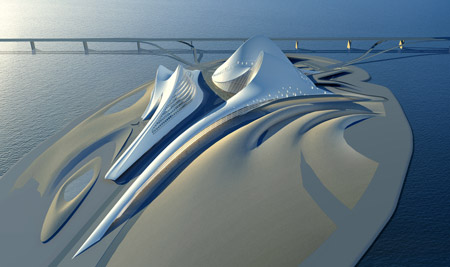
| Dubai Opera House (not built) |

So my first thought: what the hell is it? Zaha Hadid's work left many people thinking this, but that's the reason her work is so great. Hadid pushed boundaries on what was even thought of, she constantly dismantled the box of ordinary thought to create beautiful and fanciful designs. Zaha Hadid died on March 31, 2016, but not without leaving behind a legacy that will carry on for generations.
Thursday, March 17, 2016
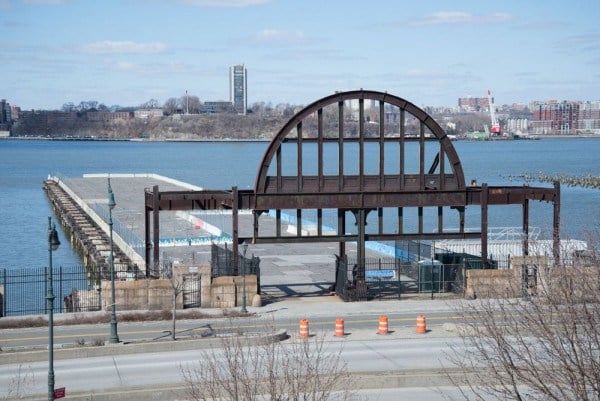
Pier 54, or Pier 55
The first image is Pier 54 and the second image is Pier 55.
This seems like common sense that Pier 55 is the more aesthetically pleasing,
and more useful of the two piers, but the issue isn't that simple.
If you
know nothing about Pier 54 nor Pier 55, they’re piers on the coast of the
Hudson River in New York City. Pier 54 is the pier that is current in the
location, and has been there for over a hundred years, but has deteriorated and
is no longer a usable pier. Pier 55 is a proposed design by Heatherwick Studio.
Barry Diller, former head of Paramount
Pictures and Fox, asked Heatherwick Studio to design the new pier. The
pier actually isn’t a pier at all, as no ships would be able to dock, but it is
actually a large off-shore park. The park would feature three performing arts
venues, along with a plentiful amount of green space. To build Pier 55, both
Pier 54 and Pier 56 would have to be torn down.
Pier 55 needs to get build, otherwise two unusable piers sit
taking up valuable real estate. Pier 55 would add another park to New York
City, which could potentially entertain people from throughout the five borough
of the city. The three venues on the off-shore park would allow for a various
amount of performance that could intern create a new livelihood to the area.
While the pier would cost nearly 118 million dollars, Diller and his foundation
have agreed to pay $100 million of this, leaving only $18 million for the state
to pay. “Its $100 million-plus
donation is a remarkable commitment even by today’s high-profile philanthropic
standards (NY Post).” The opposition argues that that they want to “build the island in the estuarine
sanctuary, which is reserved by law for environmental conservation and the
protection of marine wildlife (ArchPaper).” The argument is that the park and
its pillars into the water would disturb marine life, but the way that the park
is built would allow for light to reach under most of the park, which would
help sustain wildlife.
The park, the pier, whatever it should be called, needs to
get built. It will allow for so much more than the current piers provide. The
current piers are an eye-swore, while Pier 55 is a beautiful park that will be
continuously used for many decades to come.
Information found in:
http://nypost.com/2014/11/17/pier-55-gets-130m-bid-to-create-and-island-oasis/
http://www.archpaper.com/news/articles.asp?id=8453#.VutNOPkrKhd
http://www.archdaily.com/568286/heatherwick-to-construct-170-million-pier-55-park-off-manhattan-s-hudson-river-shoreline
Tuesday, February 16, 2016
Group Workstyles
It’s nearly impossible to form a
perfect group. Very, very rarely will anyone find four students, or adults,
that mesh and work perfectly together. But, if certain people’s workstyles are
known, a solid group can be formed. This was the direct reason for how the
groups were formed in AAD for our time periods. Couple a controlling red, a
creative yellow, a quiet blue, and a resolute green, and a recipe for success
is present.
Project: Design a garden/hope based
on a time period. For me and my group, this is the space/atomic age. Being a
red myself, I assert myself as the leader of the group. Whenever our group has
to come to together, like building a timeline, I’m quick to divide everyone up
so that we can achieve our goal quickly and efficiently. This can also backfire
though, as some group members are more focused on one topic so they ignore
others, or the final project looks slightly disjointed as different people did
each part. Dominic being a yellow, he is our group’s source of creativity, but
at times it’s downright wacky. He comes up with wonderful ideas, but lacks the
words and ability to convey his ideas to the group. With me and Ariana both
being a red, there is possibility for conflict over direction.
As far as working together, we seem
to work rather well. An extrovert, and
introvert, and two ambiverts seem to balance each other out. When in a group
setting, we wouldn’t be extremely rowdy and off task, as all members balance each
other out in some way. Dominic being the extrovert and yellow, means for our
group he is our creative loud voice. Whenever we are stuck, he is there to pick
us up. Alternatively, Kiersten being our blue introvert, we might not be able
to hear her opinion at times, as she is less likely to share it. As far as our
groups learning intakes, we are all tactile/kinesthetic. This allows us all to communicate
well with each other if we need to show another group member how to do
something.
Over all, our group is pretty
balanced. Dominic is there to bring us crazy ideas, and Kierstin can help calm
those ideas. Ariana and I are both present to make sure that no matter what the
task gets completed. We aren’t a perfect symmetry as we lack a gre
en, but we definitely come close.
en, but we definitely come close.
Subscribe to:
Comments (Atom)
